Sky Early Termination Charges

UI Design
About the project
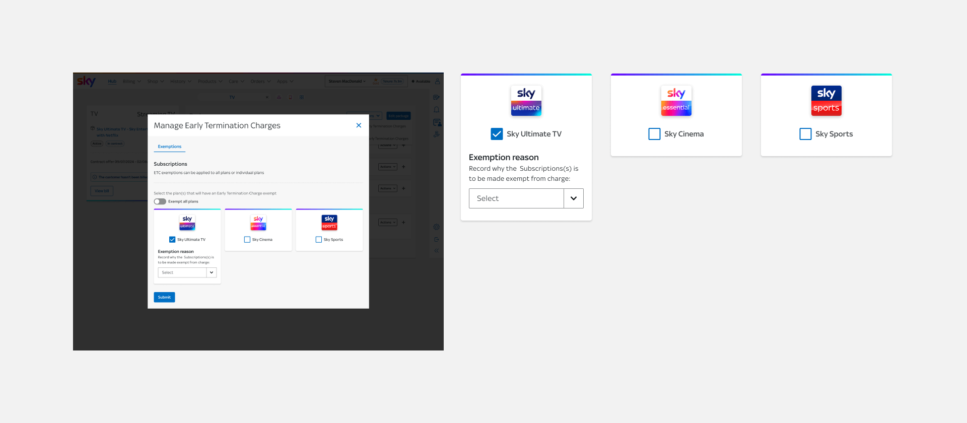
Sky offers exemptions to standard contractual terms for customers in specific situations, much like waiving fees or adjusting service conditions due to technical issues or personal circumstances.

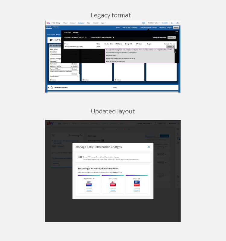
Previously, advisors had to use an outdated system. It was slow, inaccessible, and difficult to navigate, leading to inefficiencies and errors.

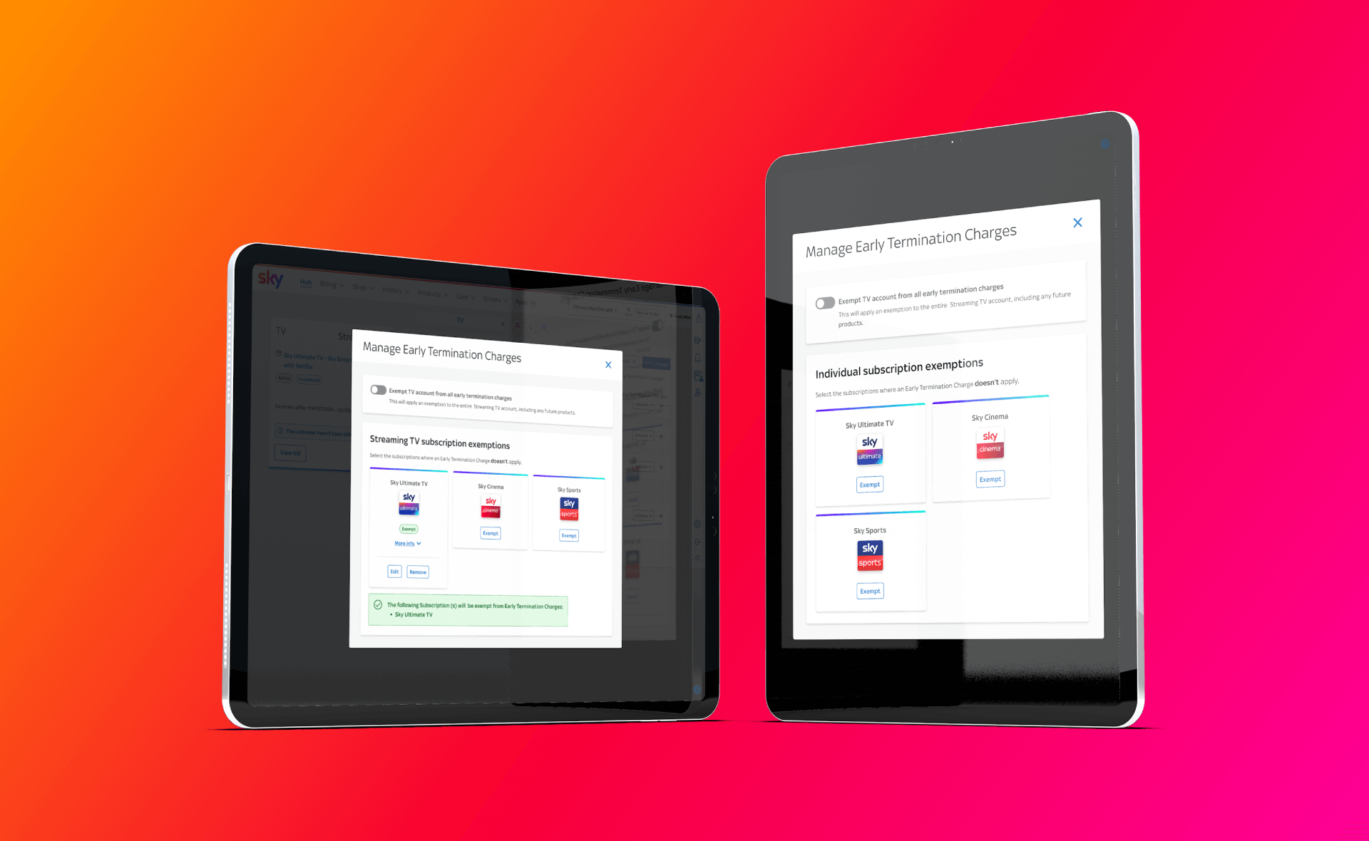
This project focused on migrating exemptions into Sirius, Sky’s main advisor platform—creating a more intuitive, accessible, and streamlined experience that aligns with modern standards.
The challenge
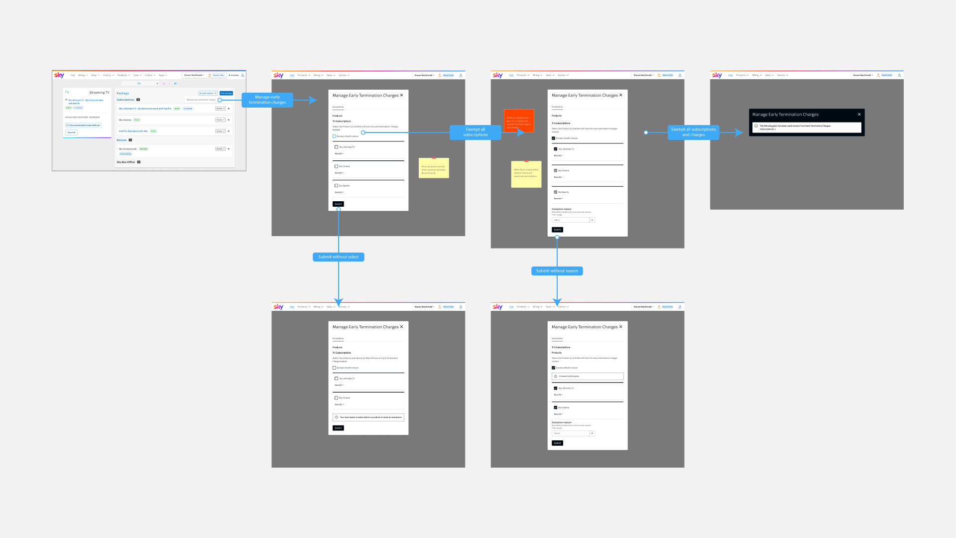
Advisors struggled to manage customer exemptions effectively due to:
  • • A legacy system with poor usability and accessibility.
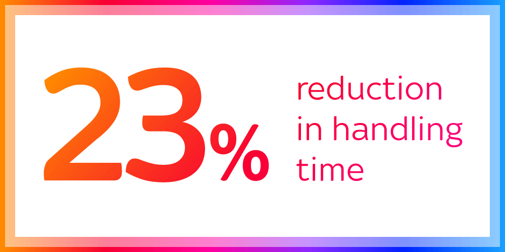
  • • Complex workflows that increased handling time.
  • • Inconsistent interfaces that caused confusion and errors.
The result was longer call times, reduced confidence, and potential compliance issues, especially for cases involving vulnerable customers.
impact summary
Goals
The new design aimed to replace the outdated system with a modern, accessible interface.
  • • Reduce friction and improve accuracy during exemption handling.
  • • Enable faster decision-making with a simplified flow.
  • • Support accessibility standards across all user interactions.
  • • Align with Sky’s principles of fairness, empathy, and customer care.
Existing User Flow
Pain points
Outdated system
The old stack was clunky and inefficient. Navigation was slow, and common actions required multiple steps.
Poor accessibility
The tool didn’t meet accessibility standards—causing challenges for advisors using screen readers, keyboard navigation, or assistive technologies. This made consistent, compliant customer support harder to achieve.
new wireframe flow
Design decisions — improving accessibility and clarity
Early iterations used checkboxes to let advisors apply exemptions to multiple subscriptions at once. This seemed efficient—until new requirements appeared.

Advisors now needed to exempt entire accounts and future products, not just individual subscriptions. The checkbox flow quickly became confusing and non-compliant with accessibility standards.

Disabled checkbox states also failed EAA compliance, making them invisible to screen readers and inaccessible for keyboard-only users.

We replaced the checkboxes with individual “Exempt” buttons next to each subscription. This small shift made the experience:
  • • Simpler to understand at a glance.
  • • Fully accessible, with proper screen reader labels.
  • • More flexible, allowing different reasons per subscription.
Checkboxes had accessibility defects
Impact & Results
as;kjhfjsdhf
Reflection
Initially, we hadn’t accounted for the full EAA requirements. When they were introduced mid-project, they reshaped our approach overnight.

Collaborating closely with the Accessibility and Development teams became essential. By adapting fast, we ensured compliance without compromising the user experience.

The biggest takeaway was that accessibility shouldn’t be a late-stage fix—it’s a foundation. Designing for inclusivity from the start creates stronger, fairer experiences for both advisors and customers.