Legacy System Limitations
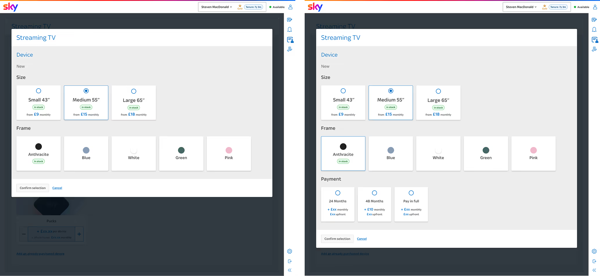
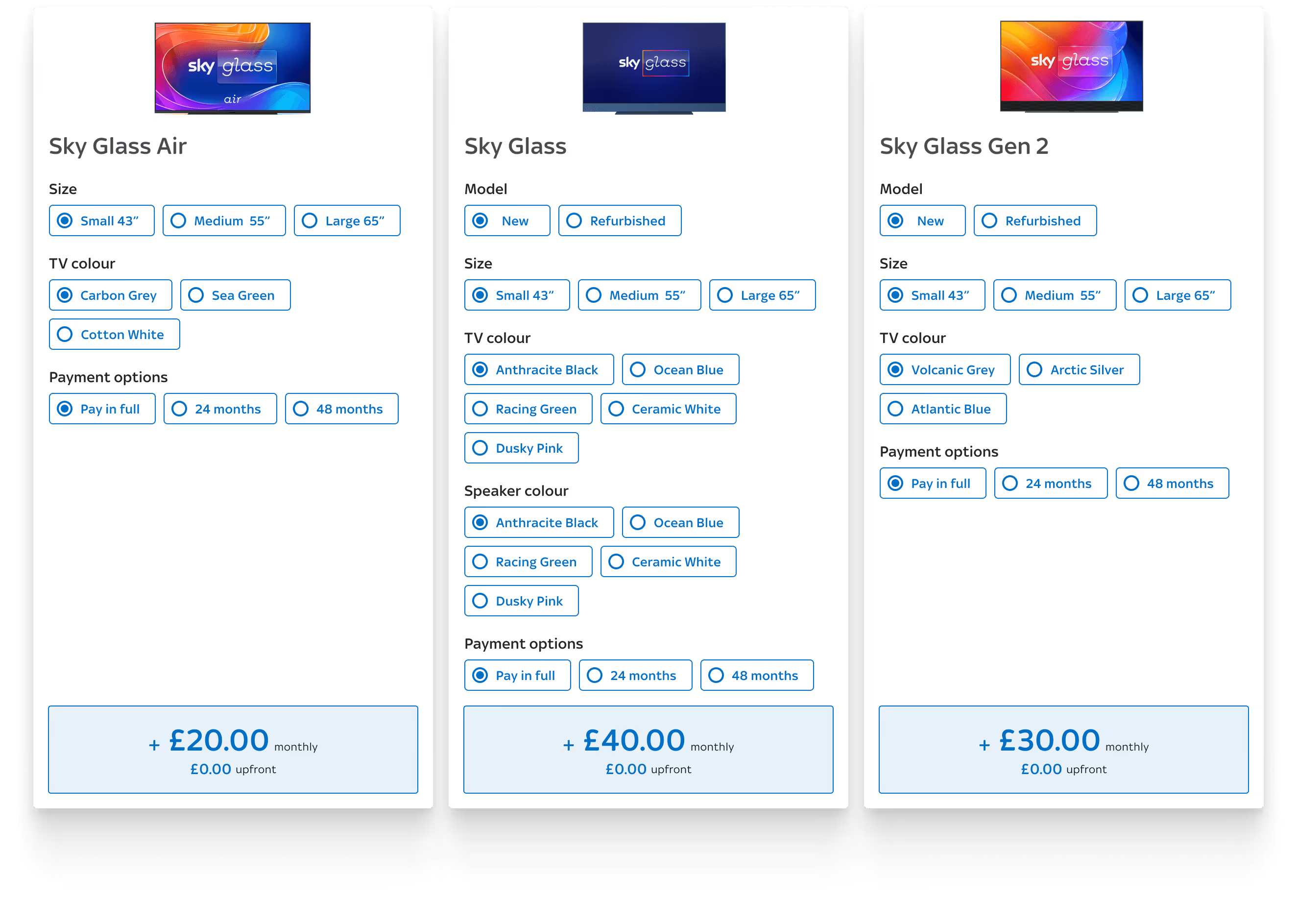
Advisors struggled to navigate between multiple Sky Glass models during sales conversations, making it difficult to compare options quickly.
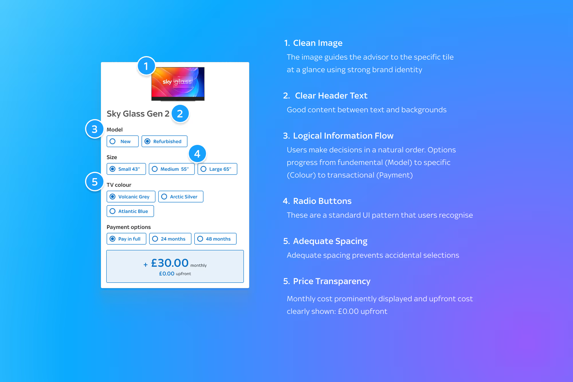
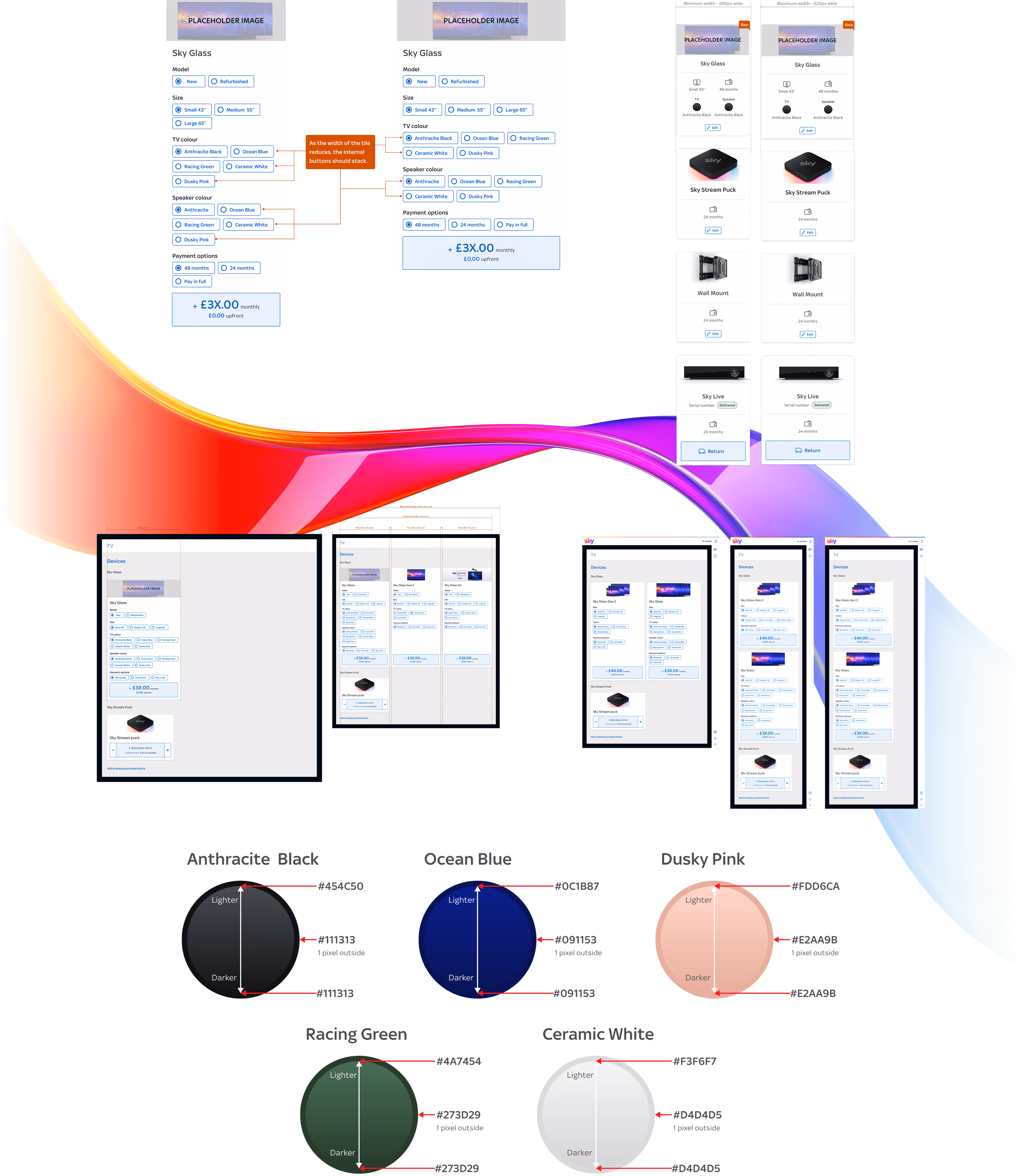
The rigid interface couldn’t scale to support new products, leading to inefficient workflows that slowed interactions and risked lower conversions.
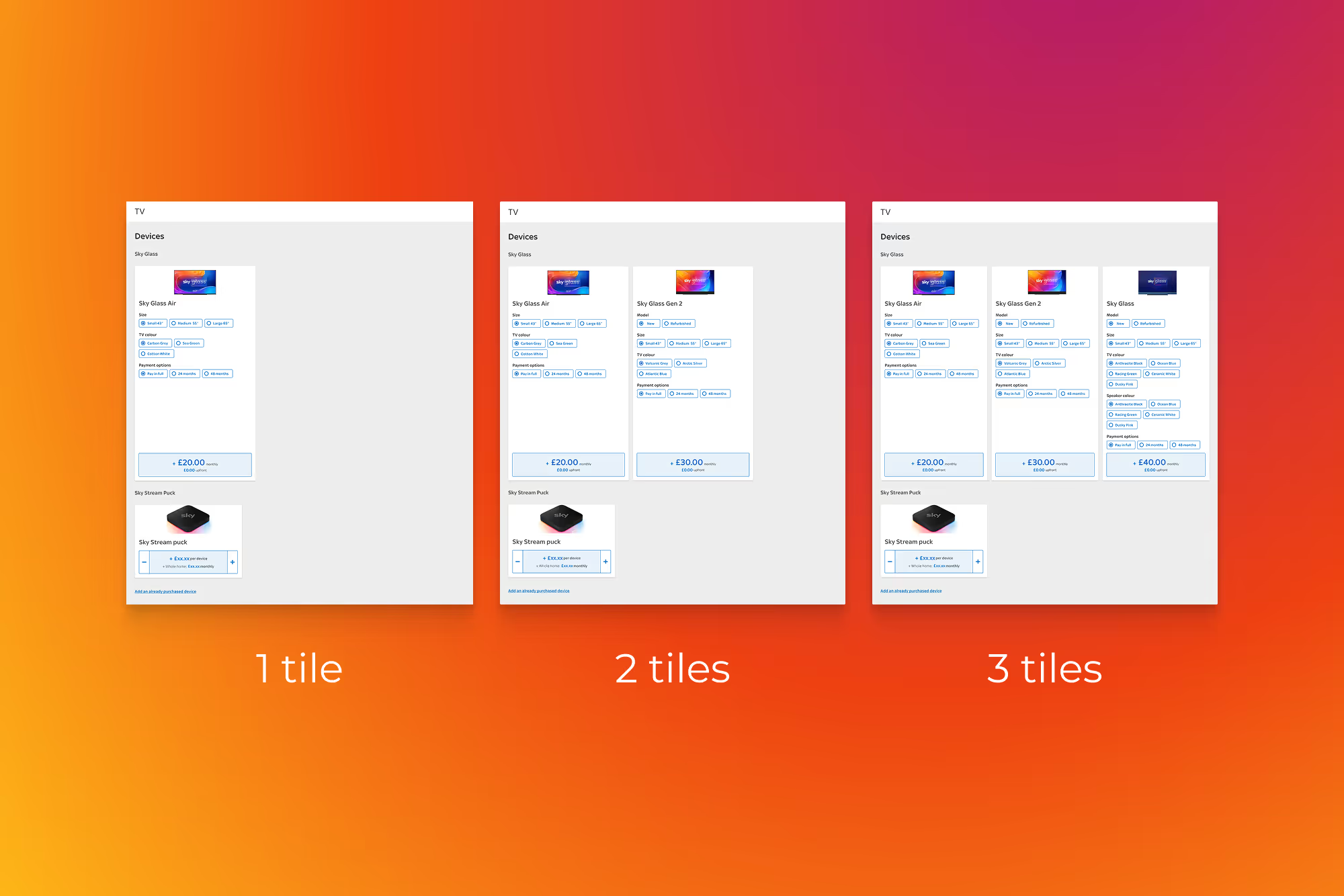
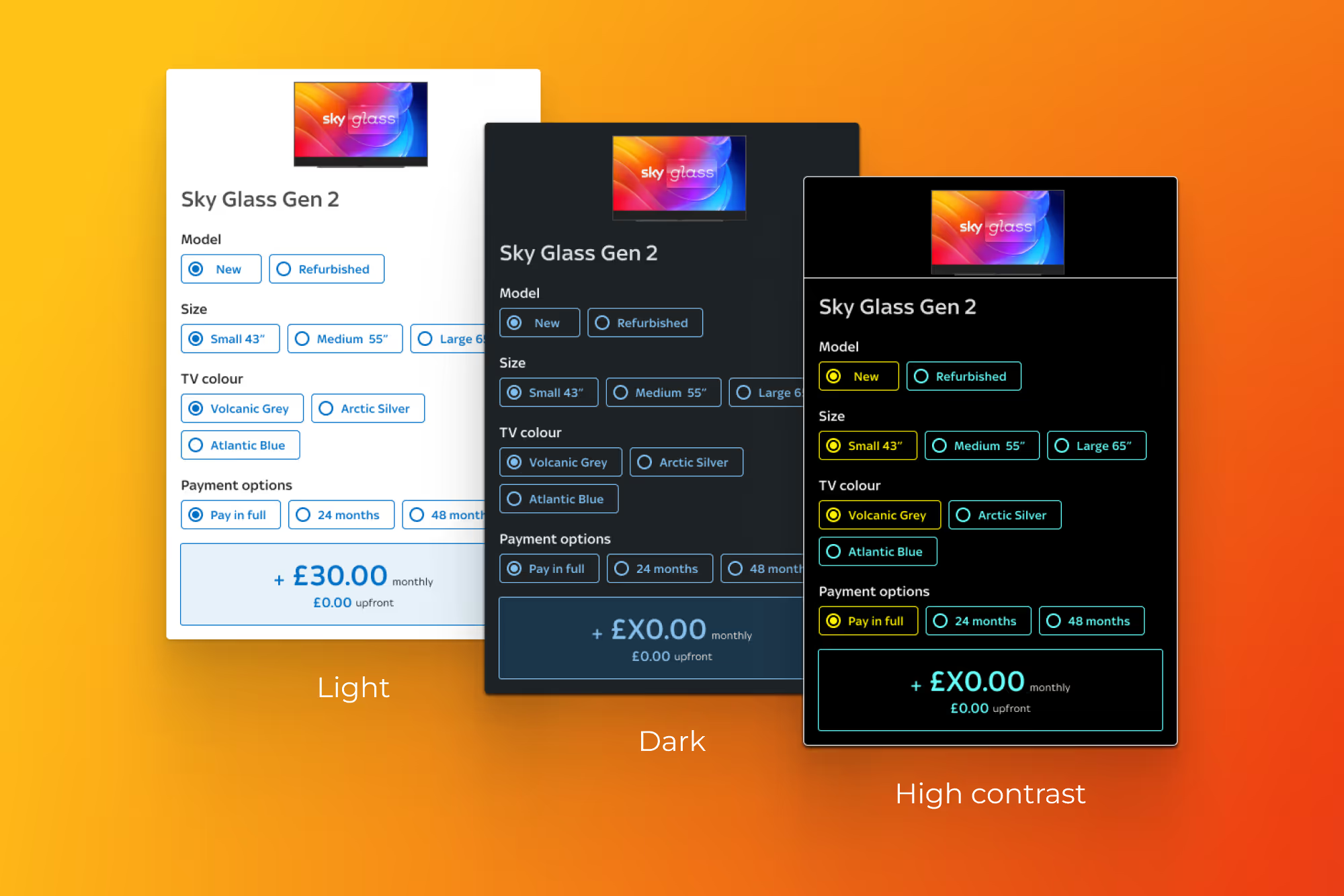
The TV section also needed to align with other platform areas while enabling easy product comparison unique to the category.
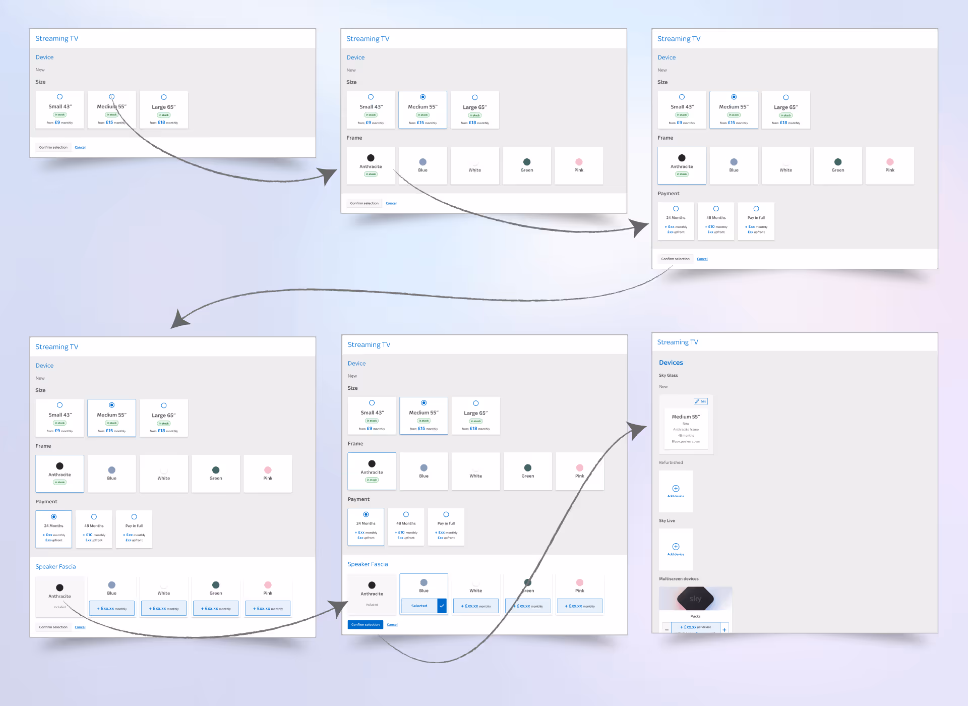
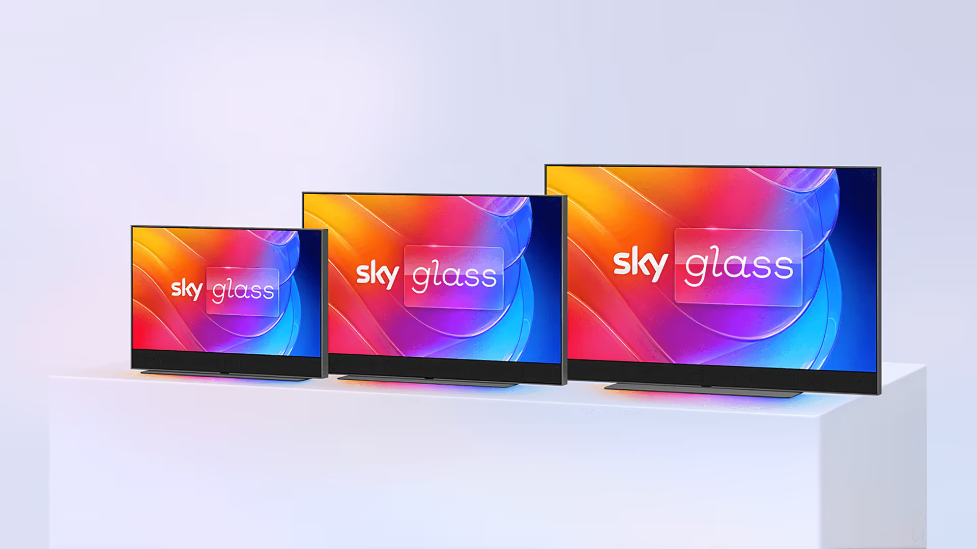
Sky Glass Sales Journey 2019 - 2024
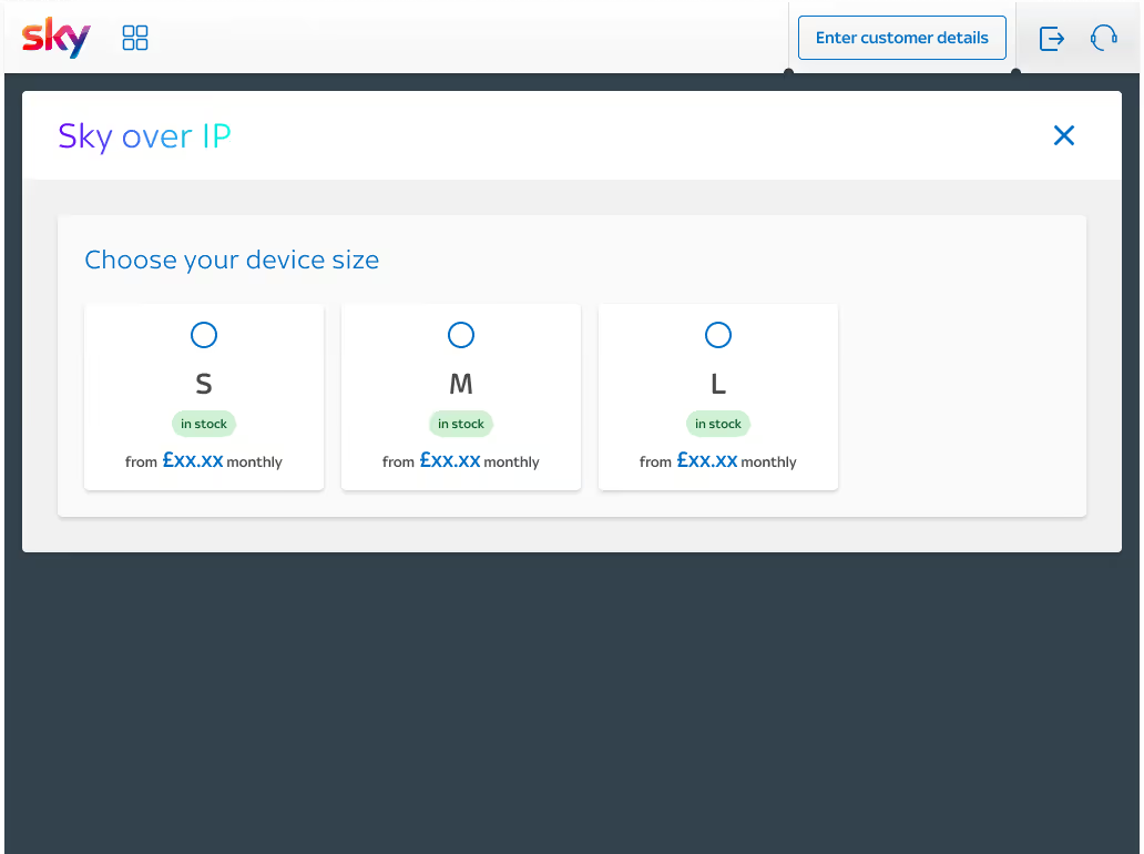
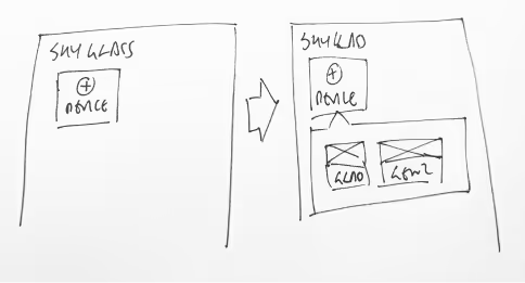
The Sky Glass sales journey was initially built with a ‘progressive reveal’ structure. This guides the user step-by-step, keeps interface clean and focused and reduces cognitive load.
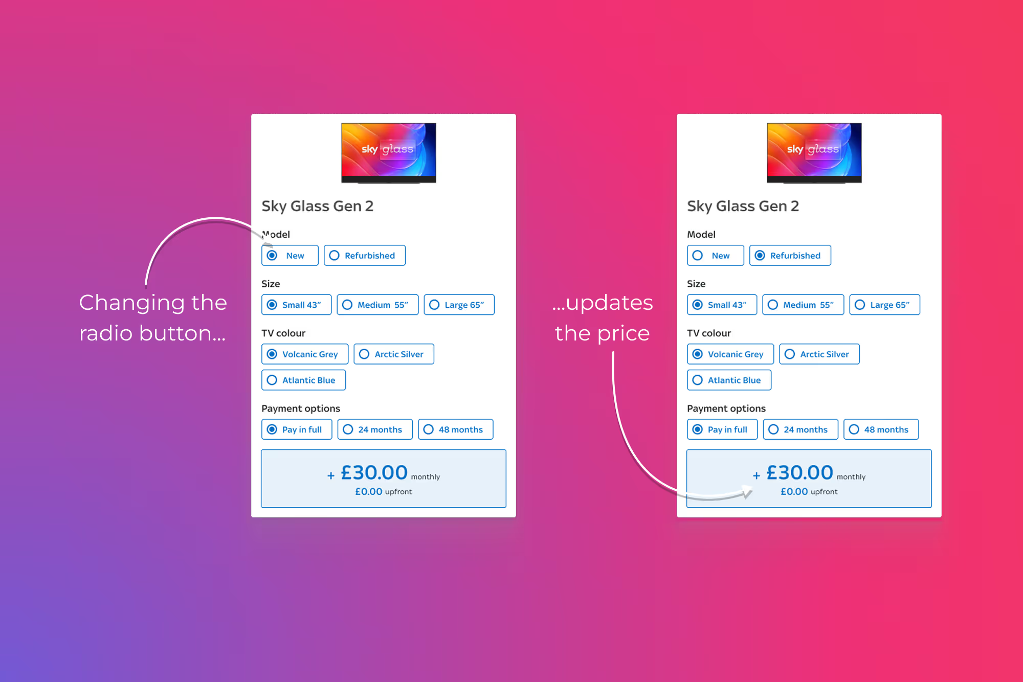
However, there were a number of problems. This eventually became slower access for experienced users, harder to compare options and also accessibility concerns.
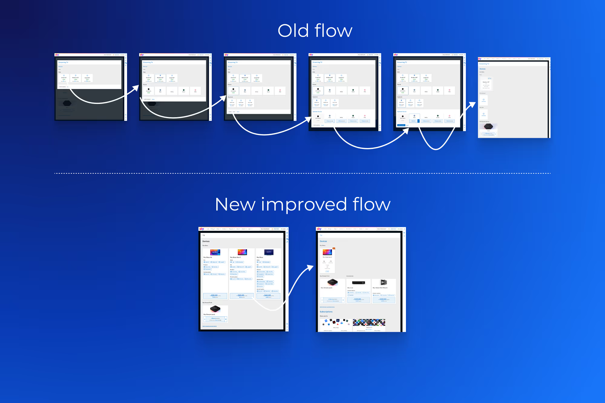
Sky Glass Sales Journey 2019 - 2024 flow