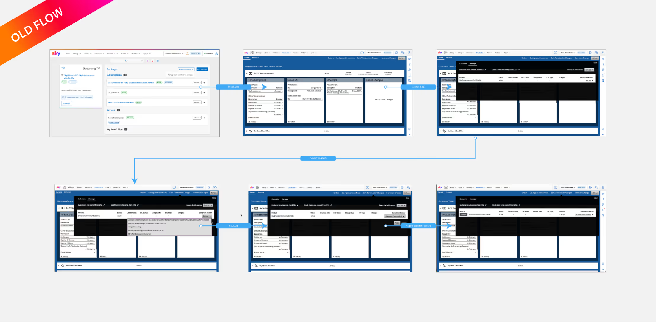
Outdated system
The old stack was clunky and inefficient. Navigation was slow, and common actions required multiple steps.
Poor accessibility
The tool didn’t meet accessibility standards—causing challenges for advisors using screen readers, keyboard navigation, or assistive technologies. This made consistent, compliant customer support harder to achieve.
Design decisions — improving accessibility and clarity
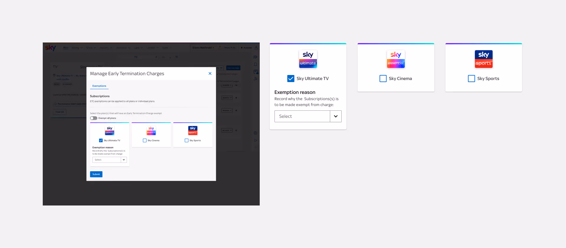
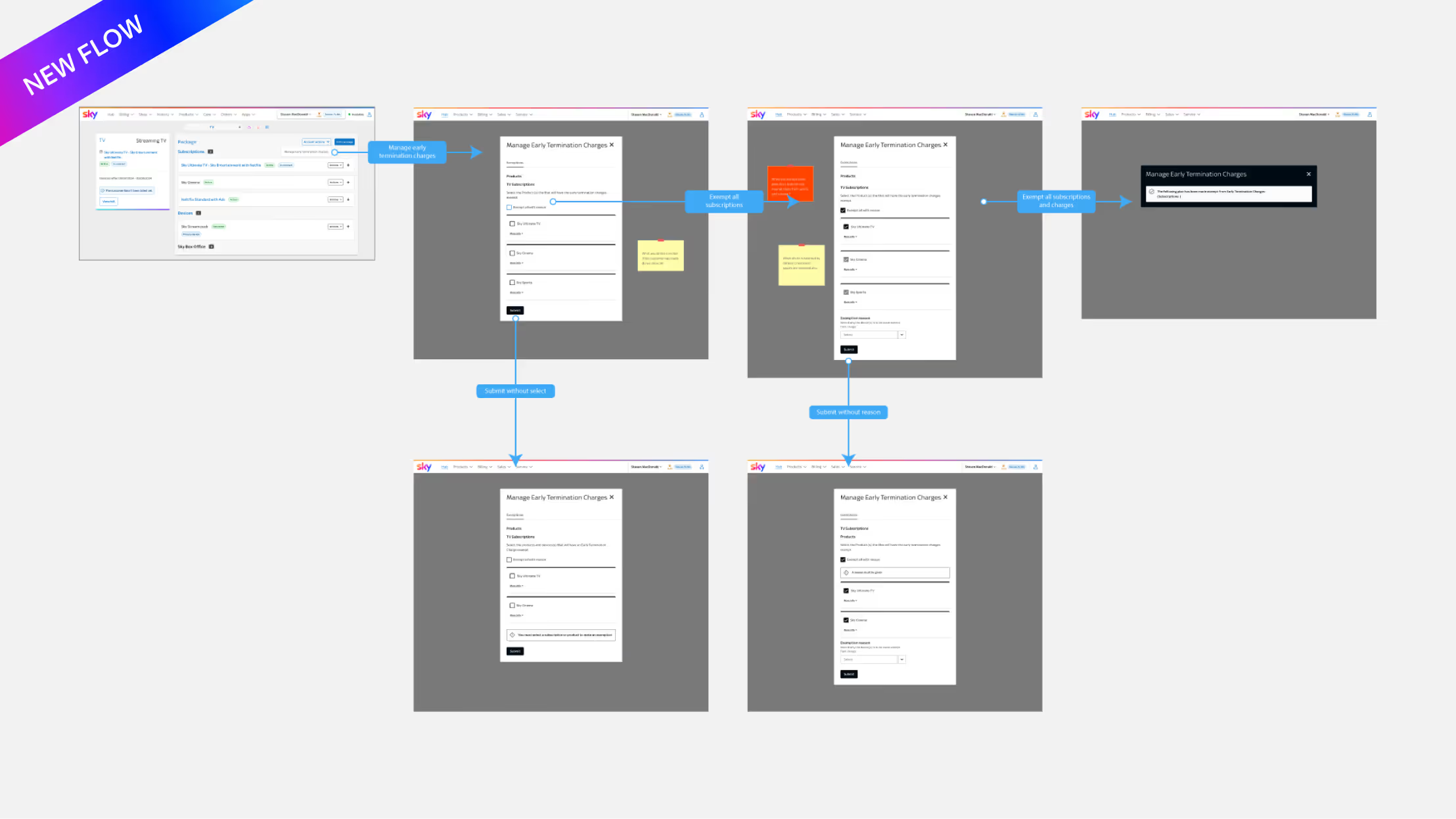
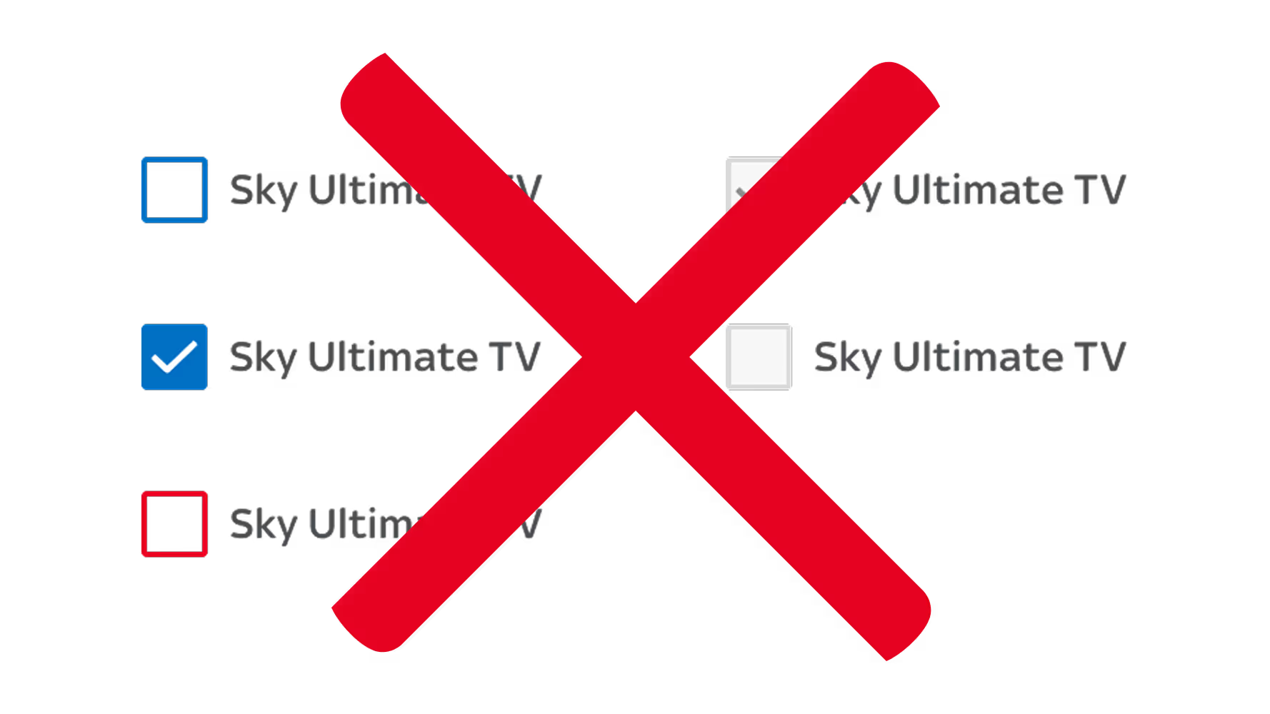
Early iterations used checkboxes to let advisors apply exemptions to multiple subscriptions at once. This seemed efficient—until new requirements appeared.
Advisors now needed to exempt entire accounts and future products, not just individual subscriptions. The checkbox flow quickly became confusing and non-compliant with accessibility standards.
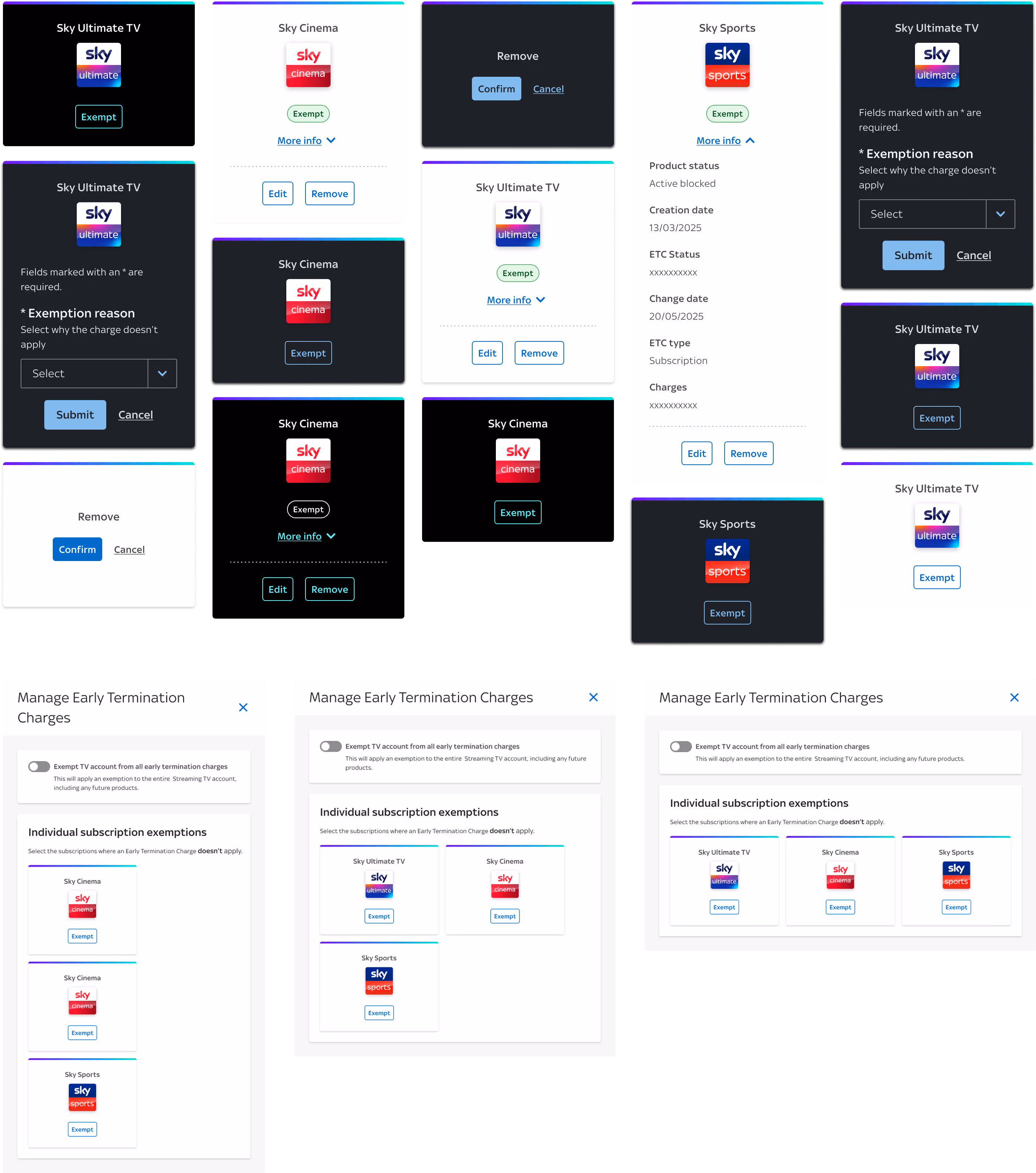
Disabled checkbox states also failed EAA compliance, making them invisible to screen readers and inaccessible for keyboard-only users.
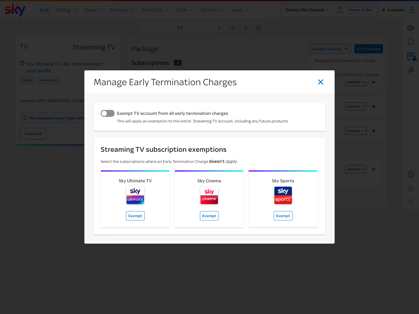
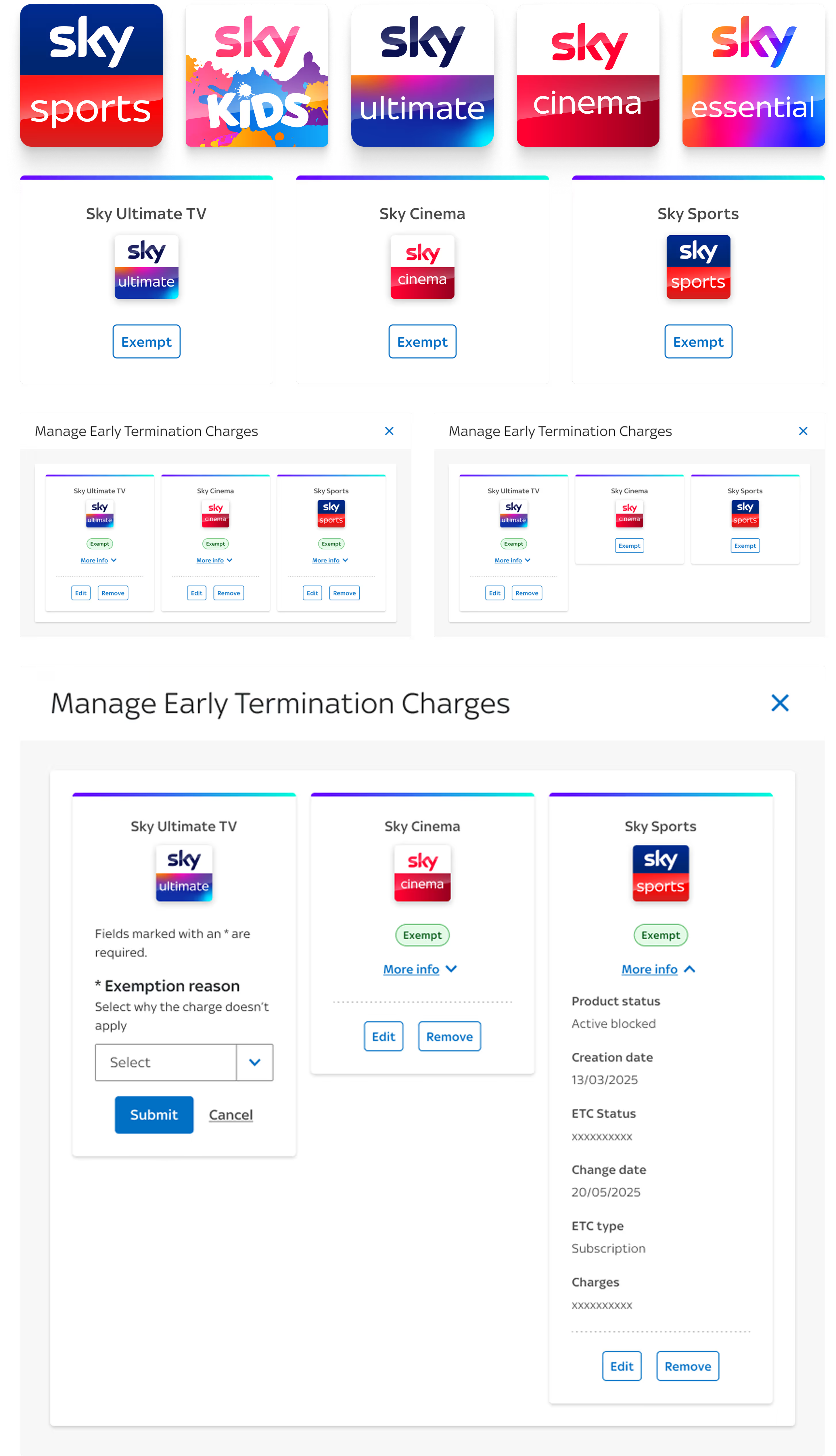
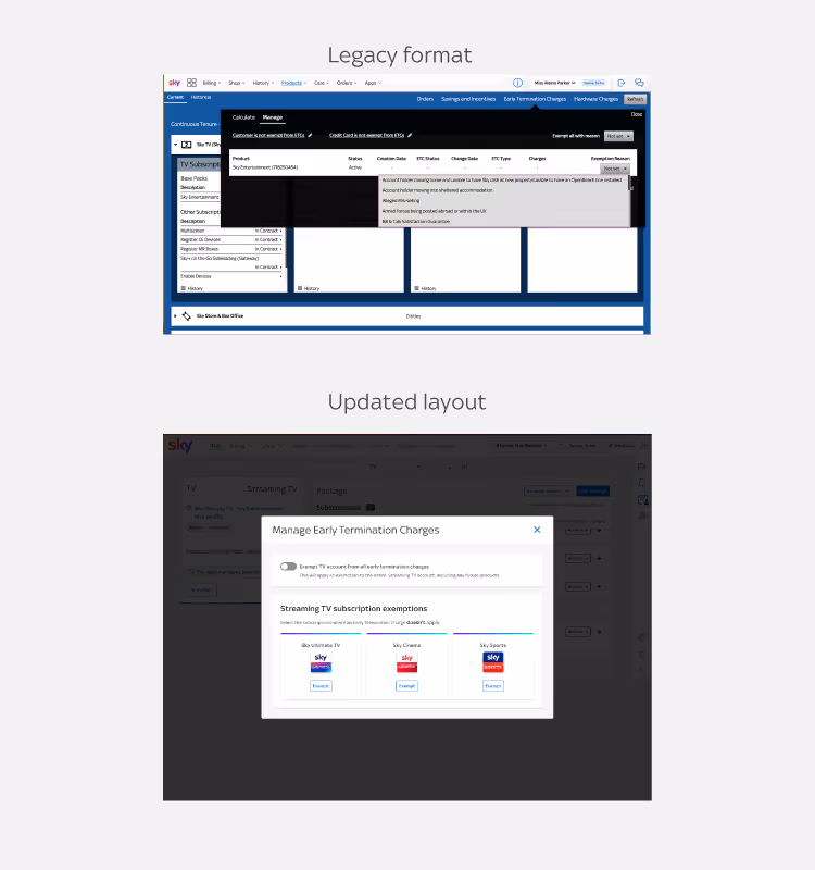
We replaced the checkboxes with individual “Exempt” buttons next to each subscription. This small shift made the experience:
• Simpler to understand at a glance.
• Fully accessible, with proper screen reader labels.
• More flexible, allowing different reasons per subscription.
Checkboxes had accessibility defects